
Fresh thinking from the team
at Sketch Group
Browse our articles by topic or publication date.
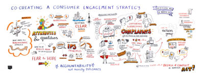
Drawing Out the Perfect Mental Health Support System
About a year ago I posted online that I was close to publishing a case study with some solid data that convincingly demonstrated the value of graphic recording and graphic facilitation. Well, here it is!
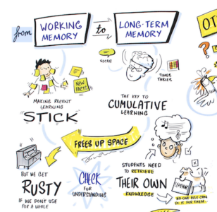
Team Alignment: How to Use Visuals to Get Everyone Singing from the Same Song Sheet
Most organisations try to solve team alignment through words — emails, slide decks, strategy documents. The problem? People skim, forget, and walk away with different interpretations. Visuals change that: when your team has literally seen the same picture, they’re far more likely to be thinking the same thoughts.
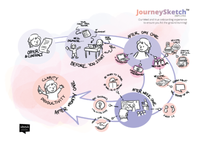
What Having True Visibility of Your Business Really Means
Most leadership teams have plenty of data — a Scorecard, a V/TO, an Accountability Chart. But data isn’t the same as visibility. Here’s what true visibility of your business actually looks like, and how a Visual Operating System (VOS®) helps EOS-run teams get there
How Sketch Videos Help Local Government Achieve Cut Through
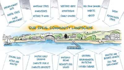
Your council ran a consultation. You sent the emails, set up the portal, and posted the updates. Three weeks later — fourteen responses. Local government communicators are under more pressure than ever to reach more people, build trust, and demonstrate results with tighter budgets. Sketch videos are helping Australian councils cut through. Here’s how.
Drawn together…literally!
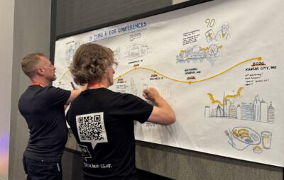
Graphic recording is usually a solo pursuit — but not this time.
When the EOS Conference in Kansas City asked us to illustrate an entire decade of conference history live at their reception, we divided and conquered — splitting illustrations, lettering, and colour across the team to beat the clock.
The result was more than a graphic record. It became an archive, a conversation piece, and a nostalgia trigger all at once.
VizConf 2026: A reminder of where I belong
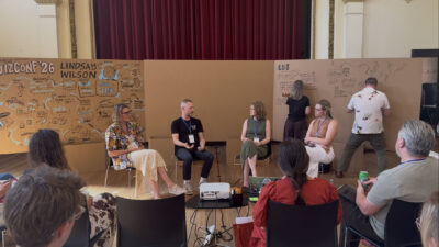
Matt gets all deep and mushy as he reflects on the recent VizConf conference.
Visual Storytelling: How A Video Turned Insights Into Action
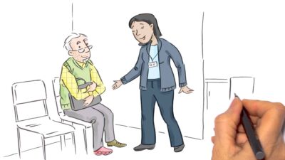
A newly published journal article shows how an animated video we co-created with University of Newcastle researcher Caroline Gibson helped general practice nurses gain confidence in recognising and responding to signs of dementia. This is a powerful example of research made accessible through visual storytelling.
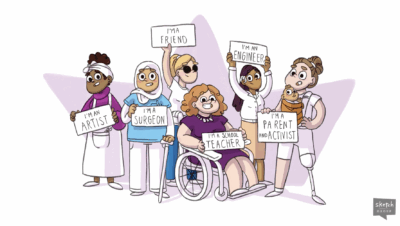
Why Sketching and DEI Are Such a Natural Fit
When we talk about diversity, equity, and inclusion (DEI), we often focus on representation, policy, or language. But there’s another, often-overlooked dimension: how we communicate ideas.
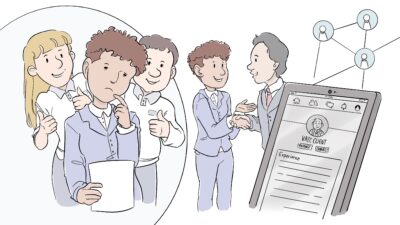
How Visual Metaphors Boost Team Alignment and Clarity
When it comes to collaboration, teams often use the same words but imagine very different […]
Insights delivered monthly to your inbox
Our market-leading Feelin’ Sketchy newsletter is an invaluable source for visual thinking, analysis and learning. No fluff. No special offers involving steak knives. Just great content.
We never spam, our promise!