
Fresh thinking from the team
at Sketch Group
Browse our articles by topic or publication date.

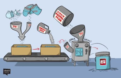
Custom Illustrations: How to Bring Company Values to Life
Illustrations can turn company values from forgettable words on a wall into vibrant, visual reminders that inspire your team every day. In this article, we explore why visualising your values matters, how illustrations support engagement and alignment, and how Sketch Group brought its own values to life through custom artwork.
Visual Storytelling: How to Use Imagery and Emotion
Words are great—but when you add pictures, the magic really happens. In this article, we dive into why drawing out your ideas (literally!) helps people understand and remember them better. Whether you’re sharing a big idea or a complex concept, visuals make your message stick—in the best way possible.
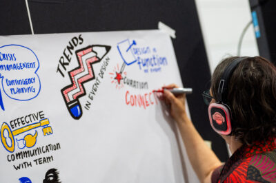
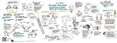
In-Person Graphic Recording or Digital Scribing: How to Choose?
Tossing up between live graphic recording and digital scribing for your next event? This article breaks down the key differences, benefits, and use cases—so you can pick the visual storytelling approach that best suits your audience and goals
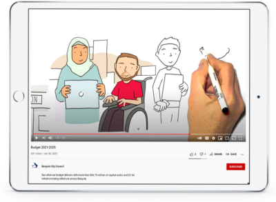
Sketch Videos: 7 Ways to Maximise the Impact of Your Video
A well-crafted explainer video is only as effective as its distribution strategy.
We provide seven proven ways to help you get the most of your explainer video and ensure your message sticks. Read on to find out how!
The Real Reason Your Message Isn’t Landing (And What to Do About It)
If you’ve ever wondered what drives the work we do at Sketch group—or why it feels so valuable when it’s done right—it comes down to one simple but profound thing.
5 Visual Thinking “Facts” (And Whether They Actually Hold Up)
There are a ton of “facts” thrown around about how visual thinking can help us learn—but how robust is this data? Let’s find out…
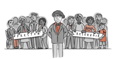
How A Sketch Video Helped Rally a Community
When Gaetano Greco ran as an independent candidate in the 2022 Victorian State Election, his mission was clear – Save Preston Market. To help spread the word, we created an explainer video that turned a local issue into a powerful community movement. Here’s how visual storytelling helped amplify his message and drive real impact.
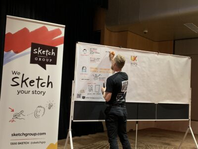
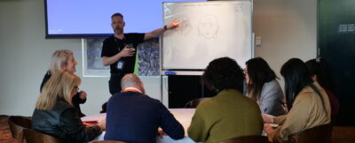
Graphic Recording – How to Improve Event Engagement
What’s the secret to hosting an event that leaves your audience engaged, captivated, and inspired? It’s all about creating a unique and memorable experience that resonates long after the event ends. One powerful way to achieve this is through graphic recordin. Read on to discover how this creative approach can elevate your event and make it truly unforgettable!
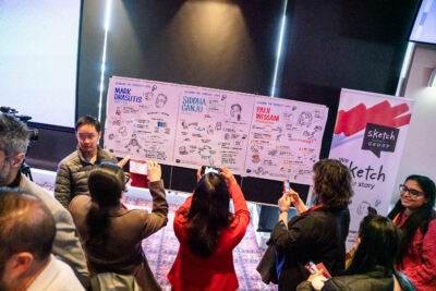
Making the Most of Graphic Recording at Your Event & Beyond
Graphic recording isn’t just a live event tool—it’s a powerful way to engage audiences, simplify complex ideas, and create lasting visual assets. After the event, it can be shared on social media, included in reports, used in presentations, or even gifted to speakers. Learn how to maximise the impact of graphic recording during, and after your event.
Insights delivered monthly to your inbox
Our market-leading Feelin’ Sketchy newsletter is an invaluable source for visual thinking, analysis and learning. No fluff. No special offers involving steak knives. Just great content.
We never spam, our promise!