
10/1/2017

There’s a whole lot of science about colour and emotion, which begs the question…
Why not make colours work for you?
And not just in a fashion sense (although there’s a reason we see a lot of red and black worn by high flyers and come on, we know you secretly judge people in tie-dye) but a business sense as well.
Some organisations just stick to one colour. Cadbury has their purple, Apple silver. Or perhaps two, McDonalds have certainly made the red and orange work for them.
But for many of us, we have a little more scope. We can open up to the possibilities of the rainbow.
Perhaps with your ongoing internal communications, your messaging, you can make colours work for you.
Something as subtle as going with the seasons. Or maybe colours that come with inbuilt messaging.
For instance, science suggests that the colour blue is associated with clear communication; red is energizing; green is for environment, health and well-being. Yellow is cheery (hello sunshine!) and orange is optimistic.
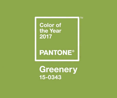
We’d also like to take this opportunity to congratulate Pantone’s colour of 2017, the happily named Greenery (or 15-0343 for those in the know). It was no doubt a tough competition with many colours just honoured to be nominated.